
A couple of alternatives to the hamburger menu
For some time, we have been swapping out full-width navigation bars for hamburger menus at smaller breakpoints - this is a great technique that optimises the space, or lack of space, at desktop and mobile sizes. But what about the masses of unused screen real-estate once the full-width navigation has turned into a hamburger?
Progressively collapsing navigation
Progressively collapsing navigations take all of the nice features from hamburger menus: toggleable, mobile friendly and they work with off-canvas nav drawers. What makes progressively collapsing navigations a better alternative is the way they utilise space, prioritise visible items and keep the optimal ‘desktop’ view for as long as possible.
An example of this can be seen on the BBC website. On large devices, you get a prioritised list of pages: News, Sport, Weather, iPlayer, TV, Radio and a More dropdown containing a few other pages. As the site is scaled down, the navigation begins to take the less important pages out of the main navigation bar and adds them to the More dropdown - leaving you with a smaller, but still prioritised list of pages.
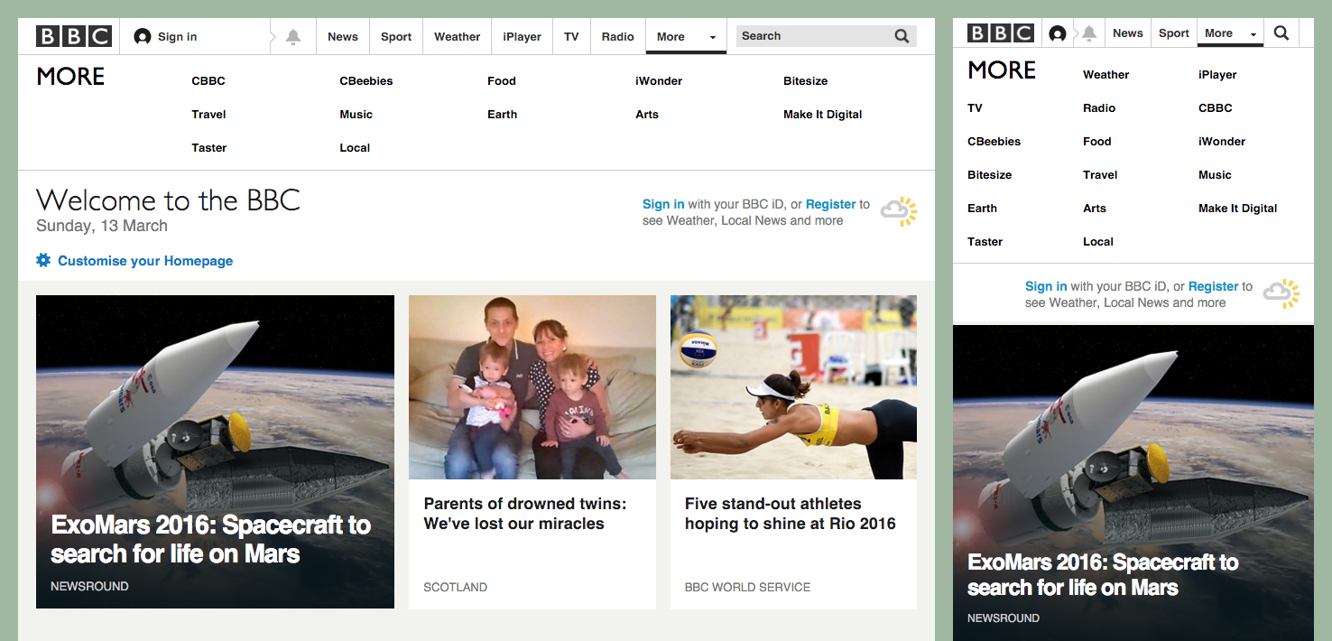 BBC progressively collapsing navigation
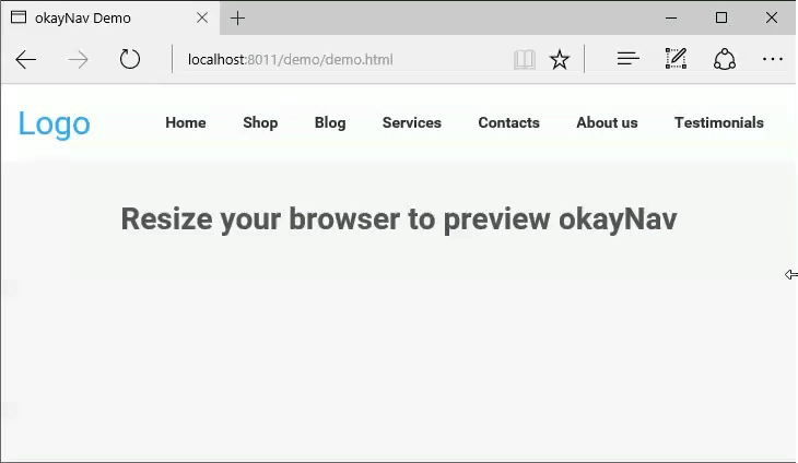
As you can see from the two examples, progressively collapsing navigations can be styled in different ways - they do not have to be off-canvas or use kebab menu icons. If you’re interested in implementing a progressively collapsing navigation, Vergil Penkov has created a jQuery plugin called okayNav that gives you a great starting point.
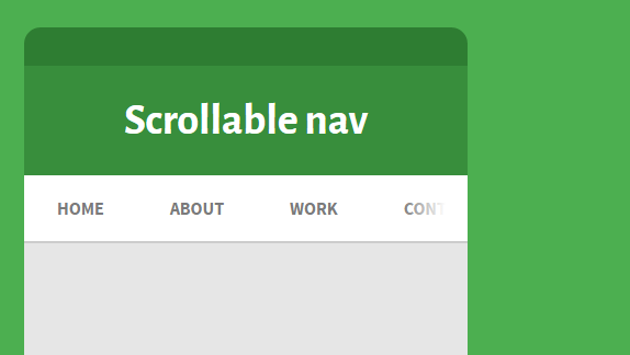
Scrollable navigation
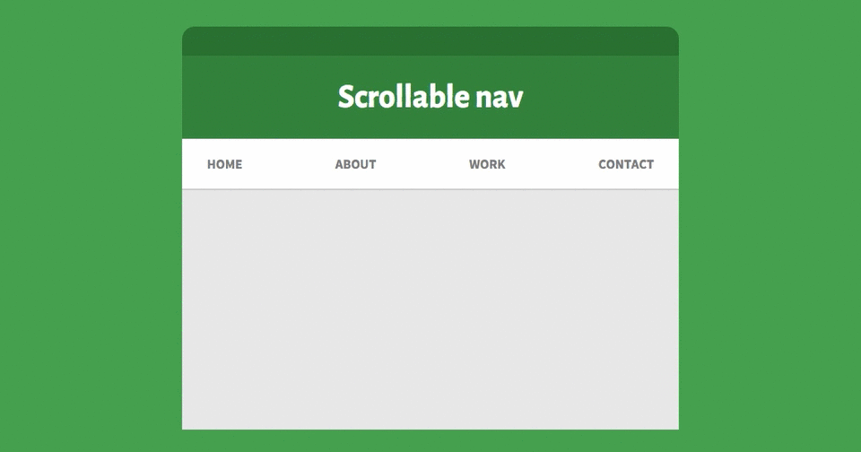
Another good alternative to the hamburger menu is scrollable navigations. For years, horizontal scrolling has been a bit of a web faux pas, but with the material design guidelines introducing scrollable tabs, we seem to have had a shift in opinion.
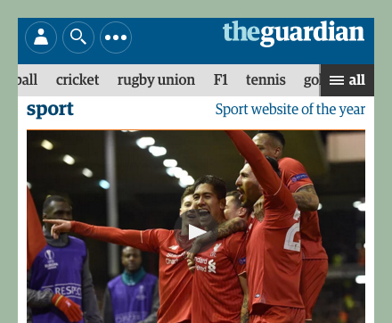 The Guardian scrollable navigation
Horizontal scrolling doesn’t always have to have ugly grey scrollbars; most modern browsers now have self-hiding transparent bars, so it doesn’t really affect your beautifully designed site. Not to mention that horizontal scrolling is a common way of navigating on native mobile apps anyway.
The Guardian have a scrollable navigation bar on their site, with an optional ‘all’ hamburger style menu. This is a great example of how larger sites can show page-specific navigation items, whilst still having an obvious way to find other sections of the site.
 Visual indicator
Edit: A few people have noted that it may not be obvious to a user that they can scroll. Visual indicators like fades and arrows can be used for usability.
Seen any effective alternatives to the hamburger menu recently? If so, drop me a comment below or tweet @KebabYusuf and I'll update the post with your findings.