Almost complete guide to flexbox (without flexbox)
Unfortunately, not everyone has a browser/device capable of viewing flexbox layouts. This is a cheatsheet-esque guide that offers backwards compatible alternatives to flexbox properties.
Whilst some of the CSS in this guide may seem obvious, I am looking to challenge the use of flexbox as well as provide simple solutions to problems were around before it became popular.
flex-direction
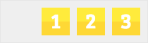
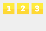
row
Displays items horizontally

.item {
  display: inline-block;
}
row-reverse
Displays items horizontally in reverse order

.container {
  direction: rtl;
}

.item {
  display: inline-block;
}
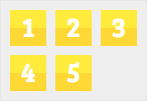
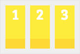
column
Displays items vertically

.item {
  display: block;
}
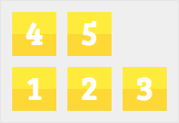
column-reverse
Displays items vertically in reverse order

.container,
.item {
  transform: scaleY(-1);
}

.item {
  display: block;
}
Credit: Vincent Valentin
flex-wrap
nowrap
Squishes items to stop wrapping

.container {
  display: table;
}

.item {
  display: table-cell;
}
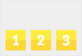
wrap
Wraps items when altogether wider than container
.item {
  display: inline-block;
}
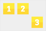
wrap-reverse
Wraps items in reverse order when altogether wider than container
.container,
.item {
  transform: scaleY(-1);
}

.item {
  display: inline-block;
}
justify-content
flex-start
Horizontally aligns items to start of container

.item {
  display: inline-block;
}
flex-end
Horizontally aligns items to end of container
.container {
  text-align: right;
}

.item {
  display: inline-block;
}
center
Horizontally aligns items to center of container

.container {
  text-align: center;
}

.item {
  display: inline-block;
}
space-between
Spaces items between start and end of container

.container {
  text-align: justify;
}

.container:after {
  content: "";
  display: inline-block;
  width: 100%;
}

.item {
  display: inline-block;
}
Note: This method only works with uncompressed HTML and requires a fixed height on the container
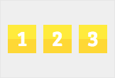
space-around
Spaces items with equidistant space

.container {
  display: table;
}

.item {
  display: table-cell;
  text-align: center;
}
align-items
flex-start
Vertically aligns items to start of container
.item {
  display: inline-block;
}
flex-end
Vertically aligns items to end of container
.container {
  display: table;
}

.item {
  display: table-cell;
  vertical-align: bottom;
}
center
Vertically aligns items to center of container
.container {
  display: table;
}

.item {
  display: table-cell;
  vertical-align: middle;
}
stretch
Vertically stretches items from start to end of container
.item {
  display: inline-block;
  height: 100%;
}
align-content
flex-start
Vertically aligns items to start of container

.item {
  display: inline-block;
}
flex-end
Vertically aligns items to end of container

.container {
  display: table-cell;
  vertical-align: bottom;
}

.item {
  display: inline-block;
}
center
Vertically aligns items to center of container

.container {
  display: table-cell;
  vertical-align: middle;
}

.item {
  display: inline-block;
}
flex items
flex-grow
Grows an item to fill remaining space

.container {
  display: table;
}

.item {
  display: table-cell;
}

.item.grow {
  width: 100%;
}
flex-shrink
Shrinks an item and other items fill remaining space

.container {
  display: table;
}

.item {
  display: table-cell;
}

.item.shrink {
  width: 1px;
}
align-self
Shrinks an item and other items fill remaining space
.container {
  display: table;
}

.item {
  display: table-cell;
}

.item.bottom {
  vertical-align: bottom;
}