Completely CSS: Custom checkboxes, radio buttons and select boxes
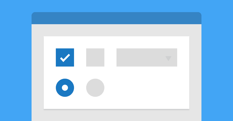
Typically, forms are the most uninteresting, uninviting and inaccessible parts of the web. This is mainly due to the complexities that come with styling form elements, and overriding browser defaults. With a little extra markup, our form elements can be styled in almost any way, and be as accessible as we choose to make them - no JavaScript required..
Note: The following tutorial is intended for beginners; if you want to get straight to the point, head to the demo and check out my demo.
Checkboxes and radio buttons
First of all, let’s lay out our HTML. In this example, we have four checkboxes: checked, unchecked, disabled and disabled and checked. We also have radio buttons in the same states.
<div class="control-group">
  <h1>Checkboxes</h1>
  <label class="control control--checkbox"
    >First checkbox
    <input type="checkbox" checked="checked" />
    <div class="control__indicator"></div>
  </label>
  <label class="control control--checkbox"
    >Second checkbox
    <input type="checkbox" />
    <div class="control__indicator"></div>
  </label>
  <label class="control control--checkbox"
    >Disabled
    <input type="checkbox" disabled="disabled" />
    <div class="control__indicator"></div>
  </label>
  <label class="control control--checkbox"
    >Disabled & checked
    <input type="checkbox" disabled="disabled" checked="checked" />
    <div class="control__indicator"></div>
  </label>
</div>

<div class="control-group">
  <h1>Radio buttons</h1>
  <label class="control control--radio"
    >First radio
    <input type="radio" name="radio" checked="checked" />
    <div class="control__indicator"></div>
  </label>
  <label class="control control--radio"
    >Second radio
    <input type="radio" name="radio" />
    <div class="control__indicator"></div>
  </label>
  <label class="control control--radio"
    >Disabled
    <input type="radio" name="radio2" disabled="disabled" />
    <div class="control__indicator"></div>
  </label>
  <label class="control control--radio"
    >Disabled & checked
    <input type="radio" name="radio2" disabled="disabled" checked="checked" />
    <div class="control__indicator"></div>
  </label>
</div>
So if you have ever worked with form elements before, you will be familiar with most of our markup - but maybe not in this order. In this example, the label wraps the input element to ensure that it’s text is clickable. It is also important that the .control__indicator is on the same level as the input so that it can be styled using the general sibling selector.
Now that our structure is laid out, we can start styling our checkboxes/radio buttons. For this tutorial, we will be wrapping our form elements in a white rectangle called .control-group.
body {
  background: #e6e6e6;
}

.control-group {
  display: inline-block;
  width: 200px;
  height: 210px;
  margin: 10px;
  padding: 30px;
  text-align: left;
  vertical-align: top;
  background: #fff;
  box-shadow: 0 1px 2px rgba(0, 0, 0, 0.1);
}
There is nothing clever about the styles above, feel free to customise these as you wish. Next we will add some basic styles to the .control element.
.control {
  font-size: 18px;
  position: relative;
  display: block;
  margin-bottom: 15px;
  padding-left: 30px;
  cursor: pointer;
}

.control input {
  position: absolute;
  z-index: -1;
  opacity: 0;
}
Note that we are hiding the input with z-index: -1; and opacity: 0; - using display: none; or visibility: hidden; would stop the inputs functioning correctly. Onto the .control__indicator - this is what we will style to look like checkboxes/radio buttons.
.control__indicator {
  position: absolute;
  top: 2px;
  left: 0;
  width: 20px;
  height: 20px;
  background: #e6e6e6;
}

.control--radio .control__indicator {
  border-radius: 50%;
}
For the purpose of this tutorial, I have styled the checkboxes and radio buttons similarly - the only modification here being border-radius: 50%; to make the radio buttons circular. Now I am aware that some of the following selectors are rather scary looking; bear with me, and try to follow the comments.
/* Hover and focus states */
.control:hover input ~ .control__indicator,
.control input:focus ~ .control__indicator {
  background: #ccc;
}

/* Checked state */
.control input:checked ~ .control__indicator {
  background: #2aa1c0;
}

/* Hover state whilst checked */
.control:hover input:not([disabled]):checked ~ .control__indicator,
.control input:checked:focus ~ .control__indicator {
  background: #0e647d;
}

/* Disabled state */
.control input:disabled ~ .control__indicator {
  pointer-events: none;
  opacity: 0.6;
  background: #e6e6e6;
}

/* Check mark */
.control__indicator:after {
  position: absolute;
  display: none;
  content: "";
}

/* Show check mark */
.control input:checked ~ .control__indicator:after {
  display: block;
}

/* Checkbox tick */
.control--checkbox .control__indicator:after {
  top: 4px;
  left: 8px;
  width: 3px;
  height: 8px;
  transform: rotate(45deg);
  border: solid #fff;
  border-width: 0 2px 2px 0;
}

/* Disabled tick colour */
.control--checkbox input:disabled ~ .control__indicator:after {
  border-color: #7b7b7b;
}

/* Radio button inner circle */
.control--radio .control__indicator:after {
  top: 7px;
  left: 7px;
  width: 6px;
  height: 6px;
  border-radius: 50%;
  background: #fff;
}

/* Disabled circle colour */
.control--radio input:disabled ~ .control__indicator:after {
  background: #7b7b7b;
}
To try and explain what we have here, I will break down the following line: .control:hover input:not([disabled):checked ~ .control__indicator]
First of all, we are using the :hover selector on the .control element, to check whether it is being hovered over, obviously. We then require that the input inside our control is :not([disabled)], but is :checked. Once these conditions are met, we then use a general sibling selector to find the .control__indicator, which we can then style as we wish.
As a side note, I recommend that if you haven't already, spend a bit of time learning all of CSS's selectors, combinators and pseudo classes - it will enable you to create more efficient and advanced styling for your sites.
Select boxes
Moving swiftly on. The markup for our select boxes is a little different, but you may notice some similarities. Like the checkboxes/radio buttons, we have a .control-group to wrap our elements in. We also have an element called .select wrapping our standard select field, as well as a custom .select__arrow.
<div class="control-group">
  <h1>Select boxes</h1>
  <div class="select">
    <select>
      <option>First select</option>
      <option>Option</option>
      <option>Option</option>
    </select>
    <div class="select__arrow"></div>
  </div>
  <div class="select">
    <select>
      <option>Second select</option>
      <option>Option</option>
      <option>Option</option>
    </select>
    <div class="select__arrow"></div>
  </div>
  <div class="select">
    <select disabled="disabled">
      <option>Disabled</option>
      <option>Option</option>
      <option>Option</option>
    </select>
    <div class="select__arrow"></div>
  </div>
</div>
Unlike the checkboxes/radio buttons, we don't hide the form element; instead, we reset the browser's custom styling.
.select {
  position: relative;
  display: inline-block;
  width: 100%;
  margin-bottom: 15px;
}

.select select {
  display: inline-block;
  width: 100%;
  padding: 10px 15px;
  cursor: pointer;
  color: #7b7b7b;
  border: 0;
  border-radius: 0;
  outline: 0;
  background: #e6e6e6;
  appearance: none;
  -webkit-appearance: none;
  -moz-appearance: none;
}

.select select::-ms-expand {
  display: none;
}
Applying appearance: none; to our select element resets any custom styling that browsers may add. We also have a -webkit- and -moz- prefix to ensure that those browsers are covered.
Edit: Thanks to @psterker for his IE10+ fix.
.select select:hover,
.select select:focus {
  color: #000;
  background: #ccc;
}

.select select:disabled {
  pointer-events: none;
  opacity: 0.5;
}

.select__arrow {
  position: absolute;
  top: 16px;
  right: 15px;
  width: 0;
  height: 0;
  pointer-events: none;
  border-width: 8px 5px 0 5px;
  border-style: solid;
  border-color: #7b7b7b transparent transparent transparent;
}
.select select:hover ~ .select__arrow,
.select select:focus ~ .select__arrow {
  border-top-color: #000;
}

.select select:disabled ~ .select__arrow {
  border-top-color: #ccc;
}
By now, you should be familiar with the way we apply styles to hover, focus and disabled states. An interesting property we have used on the .select__arrow is pointer-events: none; - this means that despite where the element is in the DOM, or positioned with z-index, you can always click through it thus triggering the select box.