Completely CSS: Tabs
My latest addition to the Completely CSS collection is CSS-only tabs. Much like the others, the code in this guide should not be used without thought - pure CSS solutions typically have poor consideration for accessibility. To find out more about creating accessible tabs with jQuery, check out Accessible tab panel system by Nicolas Hoffmann.
Creating the structure
To start with, we'll create the structure of the tabs. If you've ever used JavaScript/jQuery to create tabs before you'll notice that the structure is slightly different here. In JS solutions, the tab labels are usually grouped together, and the same with the panels/content areas. In this solution, radio buttons are used to show and hide the panels.
<div class="tabs">
  <input name="tabs" type="radio" id="tab-1" checked="checked" class="input" />
  <label for="tab-1" class="label">Orange</label>
  <div class="panel">
    <h1>Orange</h1>
    <p>
      The orange (specifically, the sweet orange) is the fruit of the citrus
      species Citrus × sinensis in the family Rutaceae
    </p>
    <p>
      The fruit of the Citrus × sinensis is considered a sweet orange, whereas
      the fruit of the Citrus × aurantium is considered a bitter orange. The
      sweet orange reproduces asexually (apomixis through nucellar embryony);
      varieties of sweet orange arise through mutations.
    </p>
  </div>

  <input name="tabs" type="radio" id="tab-2" class="input" />
  <label for="tab-2" class="label">Tangerine</label>
  <div class="panel">
    <h1>Tangerine</h1>
    <p>
      The tangerine (Citrus tangerina) is an orange-colored citrus fruit that is
      closely related to, or possibly a type of, mandarin orange (Citrus
      reticulata).
    </p>
    <p>
      The name was first used for fruit coming from Tangier, Morocco, described
      as a mandarin variety. Under the Tanaka classification system, Citrus
      tangerina is considered a separate species.
    </p>
  </div>

  <input name="tabs" type="radio" id="tab-3" class="input" />
  <label for="tab-3" class="label">Clemantine</label>
  <div class="panel">
    <h1>Clemantine</h1>
    <p>
      A clementine (Citrus ×clementina) is a hybrid between a mandarin orange
      and a sweet orange, so named in 1902. The exterior is a deep orange colour
      with a smooth, glossy appearance. Clementines can be separated into 7 to
      14 segments. Similarly to tangerines, they tend to be easy to peel.
    </p>
  </div>
</div>
Firstly, it's worth pointing out that whichever tab you want to be active by default should be checked. Secondly, be sure that the checkboxes all have the same name, in this case, tabs. There is some sample content in the three tabs that can be changed to whatever.
Giving it style
Let's start the CSS with some basic presentational styling. I haven't set the font-family in the snippets below, I'll let you decide on that for yourself.
* {
  box-sizing: border-box;
}

body {
  padding: 10px;
  background: #f2f2f2;
}
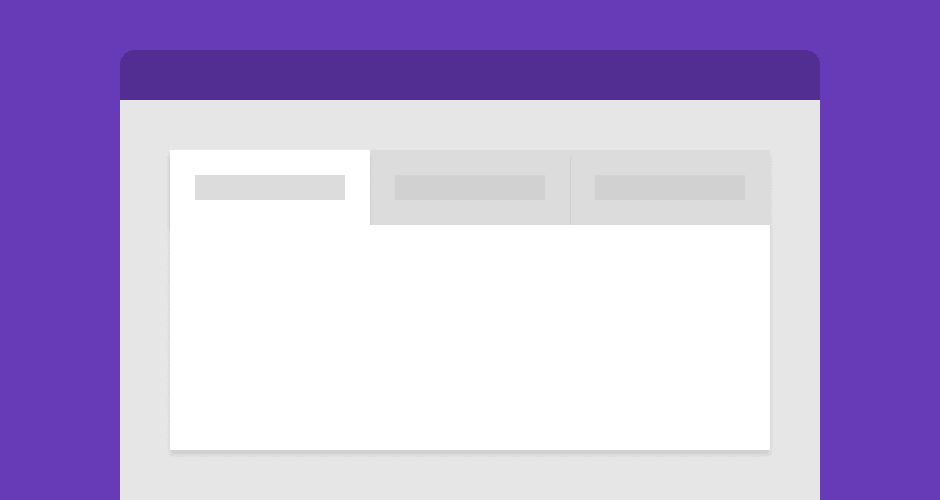
Now the container. The tabs element uses flexbox to position its children, which we will dig deeper into in a minute. The background being set here is what the inactive tabs will have behind them.
.tabs {
  display: flex;
  flex-wrap: wrap;
  max-width: 700px;
  background: #efefef;
  box-shadow: 0 48px 80px -32px rgba(0, 0, 0, 0.3);
}
We don't want the tabs to have radio buttons showing, so let's hide those. We don't use display: none; to hide radio buttons because it breaks their functionality.
.input {
  position: absolute;
  opacity: 0;
}
Next up, the tab label. Other than the basic styling, we use adjacent sibling selectors on the .input to style the .label when it is being focused on, and when it is checked. At mobile, the label is full width and at desktop, it takes up as much room as it needs.
.label {
  width: 100%;
  padding: 20px 30px;
  background: #e5e5e5;
  cursor: pointer;
  font-weight: bold;
  font-size: 18px;
  color: #7f7f7f;
  transition: background 0.1s, color 0.1s;
}

.label:hover {
  background: #d8d8d8;
}

.label:active {
  background: #ccc;
}

.input:focus + .label {
  box-shadow: inset 0px 0px 0px 3px #2aa1c0;
  z-index: 1;
}

.input:checked + .label {
  background: #fff;
  color: #000;
}

@media (min-width: 600px) {
  .label {
    width: auto;
  }
}
Lastly, the panels. At mobile, the tab labels and panels are in the correct order and work as an accordion. At desktop, the .panel is given a high order value so that it is always below the labels. By default, all of the panels are hidden and we use an adjacent sibling selector on both the .input and .label to test whether it is checked - if it is, the .panel is then displayed.
.panel {
  display: none;
  padding: 20px 30px 30px;
  background: #fff;
}

@media (min-width: 600px) {
  .panel {
    order: 99;
  }
}

.input:checked + .label + .panel {
  display: block;
}
Demo
So that's it for the code, check out the demo to see how it all looks.
This demo was inspired by the Responsive pure CSS tabs & accordion demo by mikestreety.