Password visibility toggles
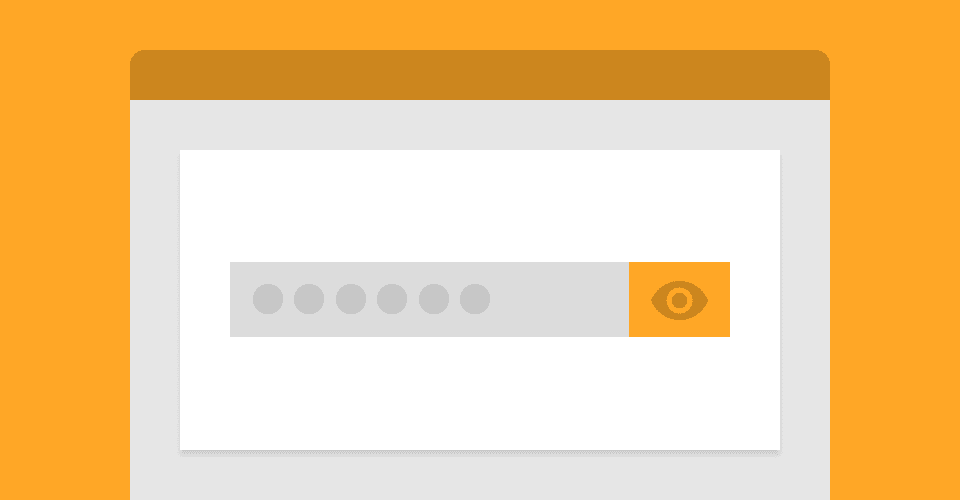
'Show password' buttons have been popping up on login forms here, there and everywhere over the last few years. In this article I will go over a couple of implementations of password visibility toggles and discuss what I would like to see done with them in the future.
So why are password visibility toggles becoming popular? Well, there is a legitimate use case. Those of us who have fat fingers find typing accurately on a tiny mobile keyboard quite difficult and are prone to mishitting keys. Having a button to quickly show if you have misspelt your password, in this case, can be useful.
To me, it’s a different story when it comes to typing my password in on a desktop - one reason is speed. Unlike my smartphone where the keyboard is on the same screen as a password visibility button, the keyboard and mouse on my desktop are separate - this makes it quicker to just hit the backspace button and rewrite the password.
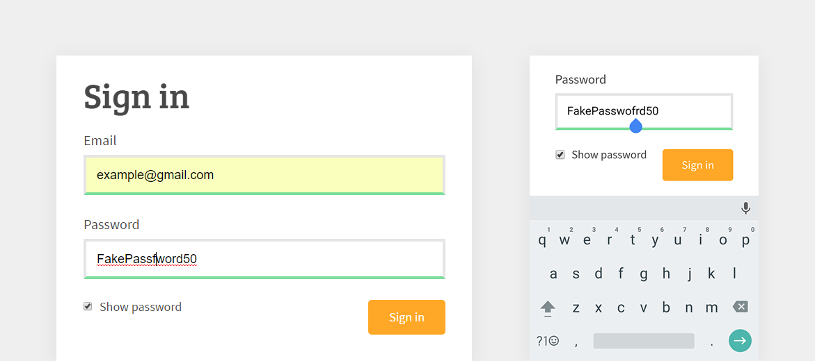
 Password visibility toggle on desktop and mobile
The main problem I have with visibility toggles is that my passwords are typically automatically filled in by Chrome, meaning anyone with access to my desktop could potentially find a login form with a show/hide button and view my passwords. I am aware that this is possible without a button, as you could simply change the input type from password to text in dev tools, however, it does make the exploit more accessible.
The same security risk is a problem on mobile too, as my Chrome account on desktop is connected to Chrome on my smartphone, providing the same autocomplete details. It is worth noting that native mobile applications do not have the same risks, as they generally don’t autocomplete passwords.
So when is it a good idea to implement this feature? Well, in my opinion, sparingly and carefully. I’ll show you a couple of implementations of password visibility toggles, and explain why the latter is my preferable way.
The examples below are simply demonstrations of the UX and basic functionality of password visibility toggles. They are not full solutions and should not be implemented as one.
Example 1 (checkbox)
The most common implementation is a checkbox and label that sits under a password input box. Upon toggling the checkbox, the password becomes visible.
For the security issues mentioned above, I have disabled autocomplete on the password input. The interaction is pretty simple, JavaScript will listen for a change on the checkbox input. Once toggled, the password field changes from having a type attribute of password to text.
In terms of functionality, this implementation is fine. The issue I have is that the ‘Show password’ text and checkbox on first glance look like the way more common ‘Remember me’ option that login forms have.
By habit, I click these checkboxes after I enter my password, so you can imagine how this implementation catches me out and makes my password visible to everyone around me - not great when you’re doing something like ordering pizza with friends around your computer (this definitely hasn't happened to me).
Example 2 (button)
Another way of implementing password visibility toggles is by having a button on the password field itself. This can be represented by a careful choice of icon if preferred.
The implementation does not differ much from the checkbox example, the main difference being the text changing depending on the state of the password field.
The reason I prefer this method is because it is obvious straight away as to what the button does, or at least what component it is associated with. It still has the same security issues, but at least it doesn’t look like a ‘Remember me’ checkbox!
Browser solution
My favourite application of a show/hide button is on Microsoft Edge. By default, Edge will add a little eye on the right side of a password input. Once toggled the password becomes visible, and the input type remains as password. The best thing about edge’s implementation is that once clicked off of the password input, the button disappears and you are no longer able to view the password - this also means that autofill passwords are not visible to anyone using your device.
 Microsoft Edge - Password visibility toggle
It is great to see Edge pushing this, and it is a feature that I would like to see added to all modern browsers. With autocomplete being controlled by browsers, it would make sense for them to also control the visibility and security of the data that they are filling in forms with - but until then, it’d be great to see show/hide buttons implemented with good UX and consideration for password security.